Controversy Sparked Over Zara’s Modified Logo
Zara shoppers express their dislike for newly styled logo.
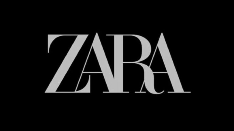
Graphic courtesy of Shutterstock
Zara shoppers beware! The letters that make out their logo—often revered as a timeless classic— and plastered on the front of every one of the fast fashion clothing company’s stores may be on its way out. After a redesign, Zara recently unveiled its new logo, much to the dismay of many of their customers. Shoppers took to social media to share their contempt for the new style categorizing it as being too squished and crowded, and even going as far as comparing it to the way clothing is organized during sales. Sophomore Alina Ahmed, an avid Zara shopper also liked it better the old way.
“It has me confused,” Ahmed said. “I like the old one better— in general, I like older versions better. I feel like Zara changed their logo after other brands did too, just to keep up with the bandwagon.”
Again and again, various corporations continue to grace their customers with new, modernized logos, in an attempt to adapt to the always changing world, and often with the effect of disappointing customers.
Your donation will support the student journalists of Troy High School - MI. Your contribution will allow us to print our work, purchase equipment and cover our annual website hosting costs.